
Case studies
Scalable Agricultural Data Exchange
Making sensitive farm-data exchange understandable, trusted and scalable
Role
UX Designer (Lead UX/UI for Pure Farming)
Product
Commercial B2B data platform (Coperation & Farmer portals)
Users
Enterprise clients, Farmers, Admins
Why data exchange was difficult to scale
The agricultural industry is highly fragmented. Farmers use many different software tools to collect data, while large organisations and research institutions require that data in consistent, standardised formats for commercial decision-making and research.
Farmers own their data and are cautious about how it is shared. Corporates depend on that data to operate at scale. If data sharing breaks down, reporting, analytics, and research stall — and farmer relationships are put at risk.
The core challenge:
How might we enable large-scale data sharing that is simple for farmers, reliable for corporates, and trusted by both?
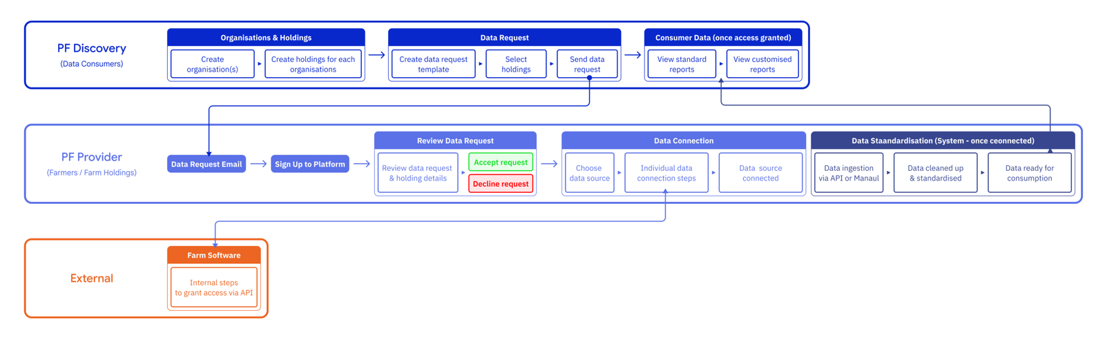
My role and scope
I was involved from early product concept and remained embedded as the platform evolved.
I owned:
- End-to-end UX and UI across Discovery (data consumer) and Provider (farmer) portals
- Product workflows for data requests, permissioning, and data connectors
- The design system and visual foundations for the platform
- Iterative redesigns as assumptions were tested and invalidated
I partnered closely with product, engineering, business analysts, scientists, and client-facing onboarding teams.
Designing for trust, complexity and scale
This was a greenfield product, but with significant real-world constraints:
- Large volumes of sensitive, heterogeneous farm data
- Multiple third‑party software providers with inconsistent connection methods
- Farmers with varying levels of digital confidence
- High‑trust actions (granting data access) that could not feel risky or confusing
Early designs were logically sound, but optimised for system requirements rather than human confidence.
Where the original onboarding model broke down
The original flow assumed a relatively linear journey:
- Consumer creates a data request
- Farmer signs up
- Farmer selects the correct software connector
- Data is ingested, standardised, and delivered
In practice, this broke down quickly.
Farmers:
- Were unsure which connector to choose
- Were asked to re‑enter information the system already had
- Were often not the person who originally received the request (owner vs manager vs worker)
To compensate, the company introduced onboarding coordinators to manually guide farmers through the process. This worked for pilots, but became a scaling risk as enterprise clients onboarded hundreds of farms.
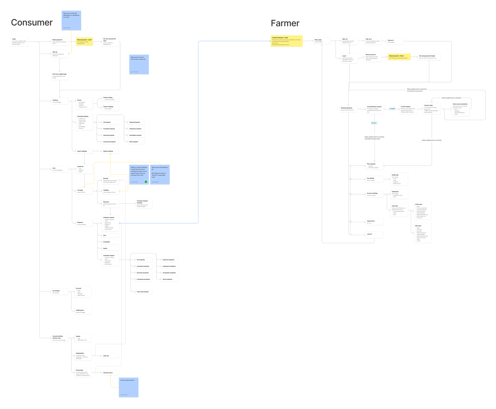
What changed as the platform scaled
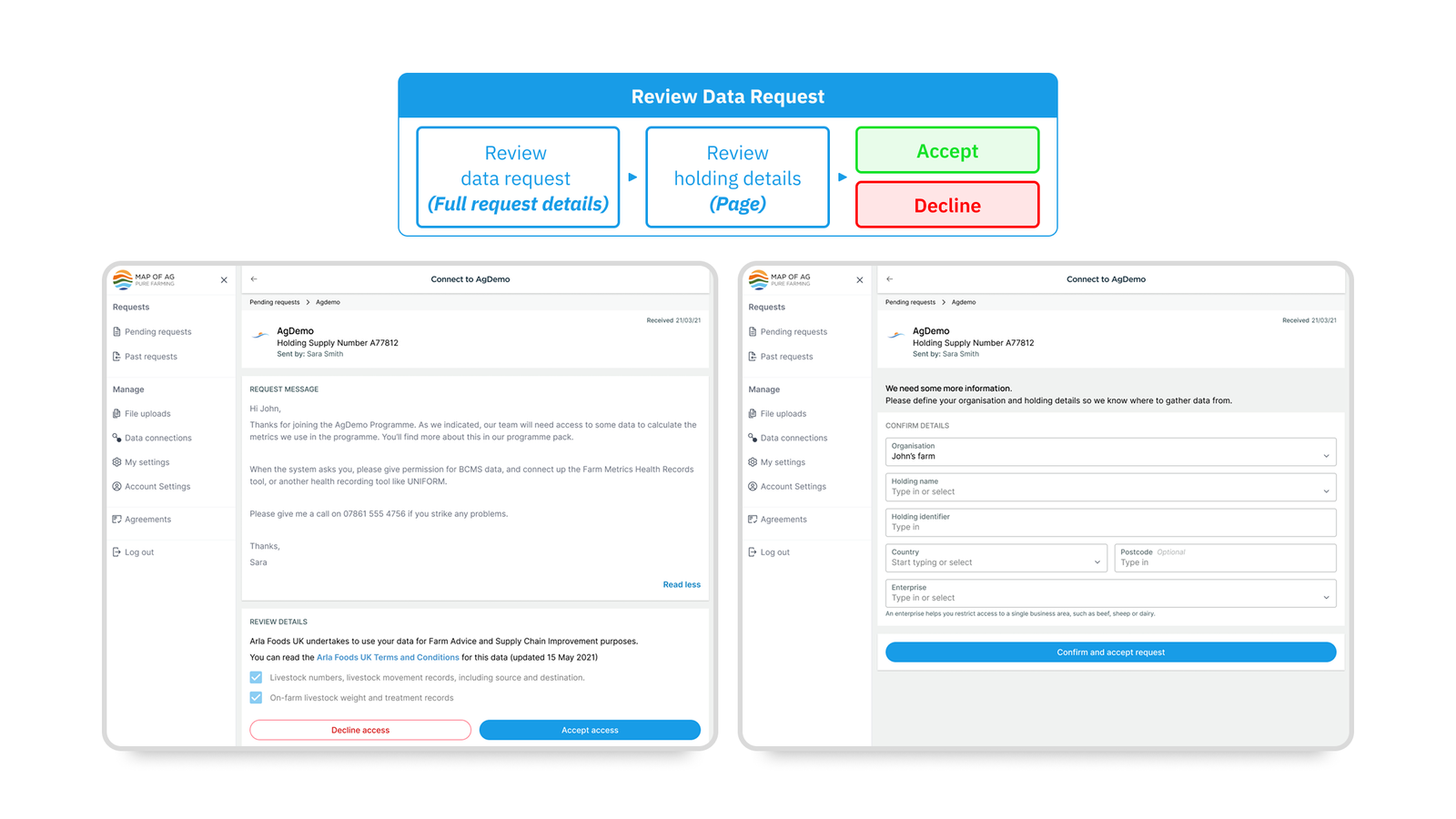
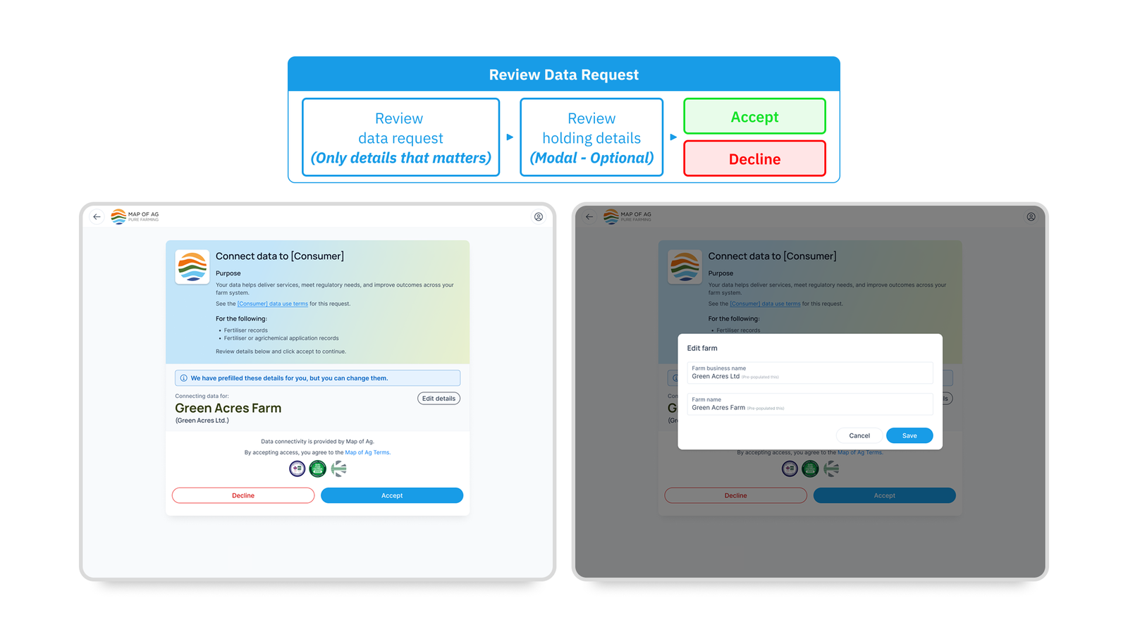
1. Farmers needed confidence, not more control
Farmers were not trying to understand data architecture. They wanted reassurance that the request was legitimate, the data being shared was appropriate, and that they were not damaging relationships.
This shifted the design focus from explaining everything to summarising clearly and reducing decision load.
Before (Image 1) vs After (Image 2)
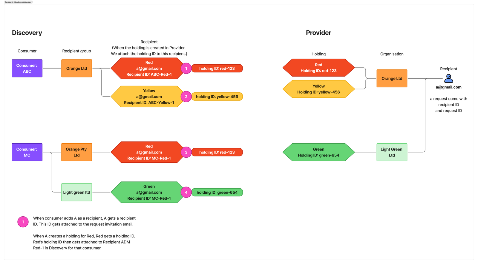
2. One farm was represented as two separate entities
From a system perspective, farm holdings in the Discovery and Provider portals were treated as separate entities. From a user perspective, they were clearly the same farm.
I repeatedly raised this as a design and operational risk. As the product scaled, this issue caused duplicate holdings, misaligned data, and manual reconciliation work. Later in the product lifecycle, identifiers were introduced to link these entities, reducing required inputs and simplifying permissioning.
3. Connector selection created unnecessary risk
As more third‑party software providers joined the ecosystem, asking farmers to choose the correct connector became increasingly risky.
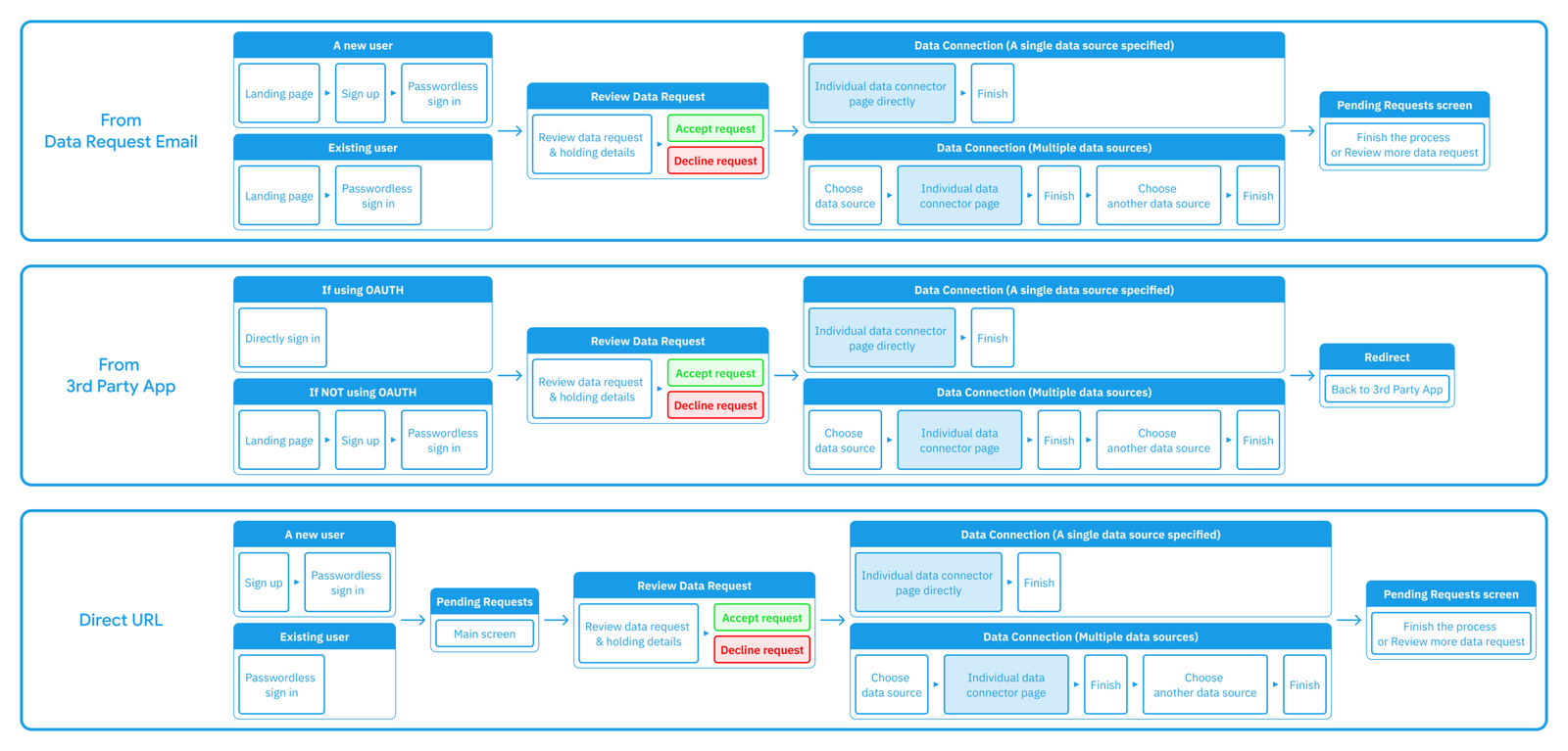
We redesigned the experience so that data request templates defined required data themes, allowing the system to infer compatible connectors. Farmers now saw only one, or a very small set, of valid options — removing ambiguity at the most critical trust moment.
Redesigning the high-trust moments
I led a redesign focused on removing friction at high‑trust moments:
- Reduced dense explanatory copy
- Introduced clear summaries and confirmation states
- Increased whitespace and hierarchy for legibility
- Positioned the farmer’s role as review and consent, not data management
Rather than forcing consistency, I designed connector‑specific guided flows:
- API‑based connectors used simple authentication and return states
- Non‑API connectors used step‑by‑step guidance for data extraction and upload
Each flow prioritised safety, clarity, and progress visibility.
Building a system that could scale with the platform
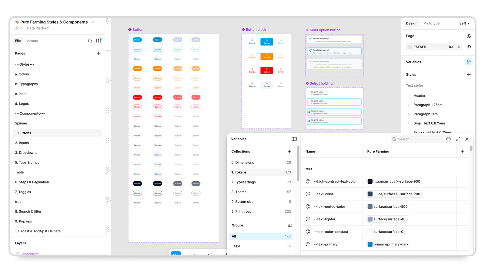
As the platform expanded, I established a design system to support consistency and speed:
- Defined visual foundations and semantic tokens
- Built atomic components for reuse
- Enabled consistent updates across multiple products and teams
This system became the baseline for all future platform work.
Results and scaling impact
As the workflows were streamlined:
- Ambiguity in the data permissioning process was significantly reduced
- Time required to complete data requests decreased
- Reliance on onboarding coordinators dropped
- The platform became viable for enterprise clients managing hundreds to thousands of farms
Clients responded positively to the UX and UI redesign and expressed confidence in rolling the platform out at scale.
Reflection
This project reinforced that:
- Removing decisions often creates more value than adding clarity
- Early design concerns frequently become scaling problems later
- Trust‑heavy experiences require restraint, not explanation
If revisiting this work, I would push earlier for lightweight instrumentation to quantify improvements sooner.